
Get in touch
Think that we can help? Feel free to contact us.
Sarah Lin Turner, UpShift’s Communications Manager, explains how you and your brand are all about perspective.
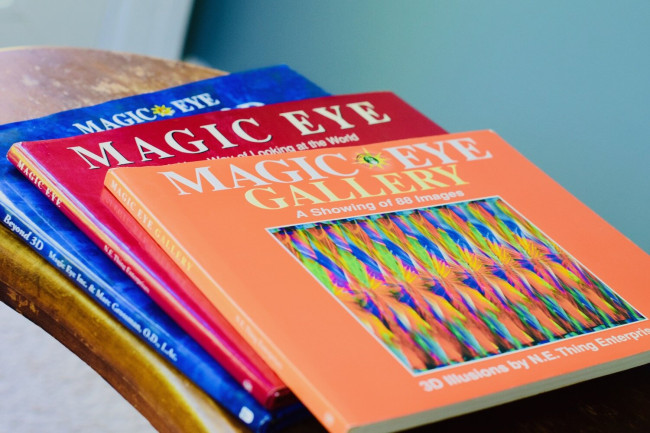
I remember the year in primary school when Magic Eye puzzle books replaced Weetbix cards as the new key to playground bragging rights. It was 1991, I was still wearing my Kiwi Kid t-shirt, and no one knew that this hallucinogenic zeitgeist was about to hit NZ shores and divide the schoolyard. The rules were simple: if you could see the picture hidden inside the bright Pollock-style patterns, you were Cool. If you couldn’t – well. You weren't even safe in the library anymore.
As a shy, bookish child, I’d always relied on reading as an escape. Unfortunately for me, Magic Eyes were not so much about reading, as looking. And looking revealed absolutely nothing, no matter how I did it.
My classmates were full of advice. Squint! Cross your eyes! Hold the book up to your face and move it away slowly – not wait – hold the book up to your face and move it away fast! Relax, no, don’t relax! – stare, but not too long.
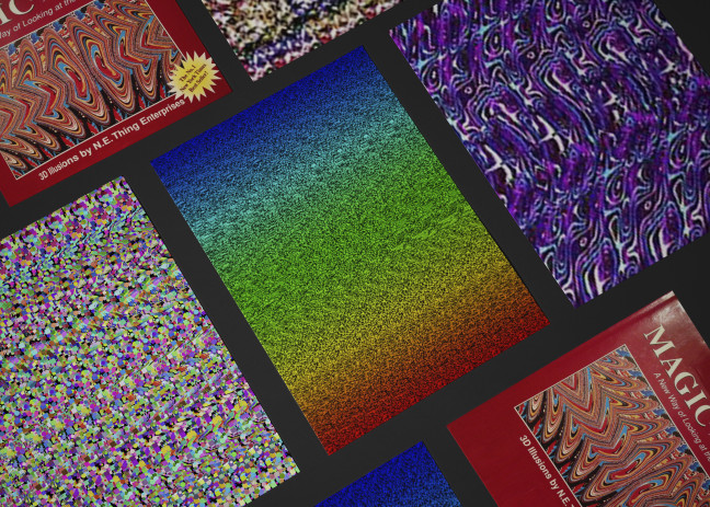
None of it helped. I only ever saw flat repeating patterns; scatter plot colours on a page. There was no 3D tiger for me. Sadly, I decided magic wasn’t meant for me.
Of course, that was three decades ago. I’ve learned a few more tricks since then. The most important thing is perspective, which is always based on where the viewer is standing. And for most of us, the second we look at the picture, we’re inside the detail.
The same is true for working within an organisation. Most of the time, the tiger is far from our minds. We’re focused on the details, on making the patterns happen. Those mechanics make sense to us. But we can forget to stand back, look wide and deep – and see what others see.
This is how “brand” works. You may well be making the most beautiful patterns ever with logo, fonts, photos, and language, but if your intended audience can’t see the tiger, the magic fails.
Creating and supporting brands is part of UpShift’s core business. We help clients clarify who they are – their big-cat-of-choice – and then we build the patterns that paint the portrait.
Of course, like most small businesses, we’re real busy making the magic for others. But what about our own? The UpShift brand turned ten years old in 2023. It was absolutely time to step back, look at the big picture, and apply our expertise to ourselves.
Back to the drawing board?
First of all – what is a 'brand?'
Thanks to the internet and social media, there’s probably more awareness of what ‘brand’ means than ever before. It's not just industry lingo. We all think about how we represent ourselves online. Brand is inextricably linked to personal identity – and organisations have a personal identity too.
Your brand is who you are, what you do, and how you do it.
To continue our metaphor, the Who You Are is the tiger. The patterns that build how we see the tiger are ‘brand elements.’ These include obvious things, like logos, taglines, colours – what you might see in an advertisement or an organisation’s website. But they can also be less obvious, less overt: more of a subconscious message.
Your brand elements are how you communicate who you are – what you choose to guide, reinforce or change your clients’ perspective.
It’s very rare that updating your brand will call for a whole new canvas.
Even when your organisation realises a refresh is needed, whether it’s because you’ve changed, or the world has, there will usually be elements of the brand you want to keep – and UpShift doesn’t advise throwing your history away.
This was certainly true for us. In 2023, UpShift celebrated ten years in business. A lot can change in a decade. Identities evolve and so do industries. We didn’t need to start from scratch, but we did need to start somewhere.
That meant clarifying who we are and what we do – and how to communicate this to the right people.
Who are you?
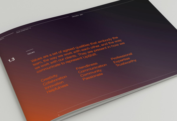
In order to get some answers, UpShift first decided to identify and embed our organisational values. These are professional and ethical principles that express who we are and guide how we work.
Values exercises can be mind-numbing, but as the person leading the project, I wanted to ensure everyone on the team was engaged. It would defeat the purpose to write a poster, stick it on the wall and forget about it. Fortunately for me – (recently joined at the time and quietly terrified by the technical talent around me) – the team embraced the process with trust and enthusiasm.
I asked everyone to send me a secret list of five words that described the behaviours or attitudes they saw as crucial to great work, a great workplace, and great relationships with clients and colleagues. No collusion allowed! I really wanted to get an impression of each person’s individual thoughts.
It didn’t surprise me that the collated results showed plenty of repetition anyway. Again, we weren’t starting from scratch. These people knew the tiger, even if the patterns weren’t quite right on the page.
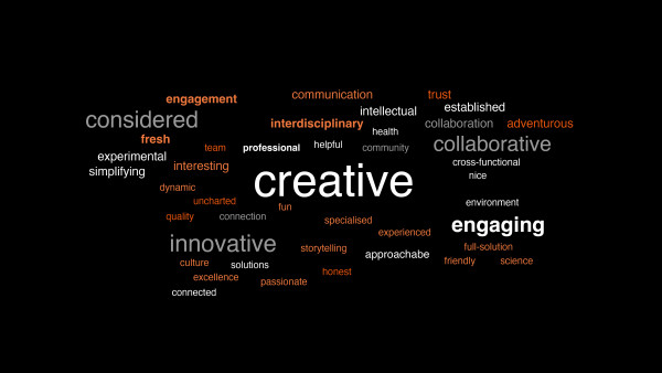
I used an old-school world cloud generator to see which words popped up the most, curated them through a communications lens, and laid the top 20 out for group discussion. Which felt strongest? Most important to us and our work? What did we want UpShift to stand for – and how did we want others to see that?
The resulting Values gave us answers, and an incredibly strong framework for moving forward with the brand.
Who wants to know?
We’d figured out what to communicate. Now, to inform how we would do it through language and design, we needed to define who we were communicating to.
We went through the Five Words process once more, asking the team to describe the types of clients and colleagues we love working with. The idea was to create an ideal archetype – not necessarily a reflection of reality, but a clear enough picture of who we wanted to respond to the brand. Crucially, this included ourselves. If we didn’t care about UpShift and our work, how could we expect to attract clients who would?
The “ideal archetype” produced an imaginary viewer whose perspective we could guide towards the tiger.
Brand Refresh: Evolution, not Revolution
Your history is still a part of your identity. As we said, most brands are not going to need to drain the whole bath - that can mean risking some of the good stuff!
The insights from our exercises helped us see which brand elements needed to evolve.
This meant assessing everything from our logo, to the main tagline we use to describe ourselves, to the types of images we use, the design of our website – right down to the language we use in everyday emails: our brand ‘voice.’
Logo
Logos, done right, look deceptively simple. But there’s a reason they’re a million-dollar business, and the process is not nearly so simple as the result may appear.
Our Creative Director spent several weeks assessing the existing UpShift logo, researching and testing alternatives. What still worked? What missed the mark?
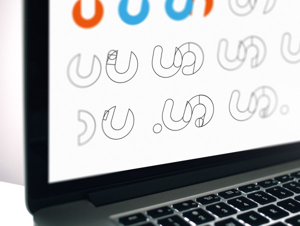
Our old uppercase ‘UPSHIFT,’ which had previously felt confident, now seemed a little shouty and aggressive. This didn’t quite align with our values of being friendly and approachable. We decided to soften it with a new mixture of upper and lower case. (This spilled over into how we now use upper and lower case elsewhere, like our website and various marketing).
The former US graphic needed the same treatment. By rounding the letters out, tweaking sharp lines and corners and italicising the typography, we were able to achieve something strong but gentle, with a forward slope suggestive of our creative, innovative team.
These changes might seem minor, but every subtle tweak communicates something to the subconscious. Getting the visual balance just right took many iterations. We printed each out and pinned them to the wall so we could take that necessary step back and get perspective.
The original UpShift logo complete with uppercase ‘UPSHIFT’
First draft of a re-drawn ‘US’ icon and an upper and lowercase ‘UpShift’
The new italicised ‘US’ wasn’t italicised enough so this versions increases the angle for more dynamism.
However, the gap between the end of the ‘S’ and the upstroke of the ‘U’ is too close. This version increases the space and the black outline shows the previous shape for reference.
This version shows the difference between the final approved ‘US’ and the original.
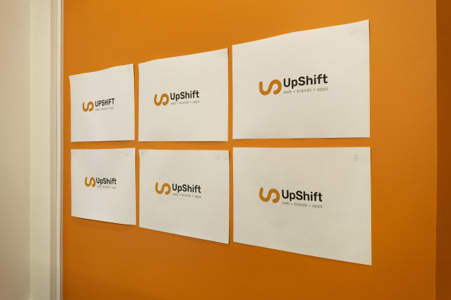
The final choice of ‘US’ symbol upper and lowercase ‘UpShift’ in the same font as the original plus the new strapline.
Strapline
We decided early on that the strapline, (a succint selection of words used by businesses to express their value proposition), also needed to change to reflect the evolved brand and be a better description of who we are and what we do.
The team tossed around many, many ideas. It can be difficult to come up with something sharp, accurate and compelling, especially when so many words already have brand or industry associations, or are just generally overused.
Eventually, after weeks of playing with how different lines looked and felt, we came up with ‘Creative. Digital. Development.’ And it just fit. It’s exactly what we do and how we do it. It communicates our focus, talent and expertise, and emphasises the unique value of human creativity in the face of AI technology.
Leave only footprints
Now that we’d come this far, we needed to ensure that our brand footprint – how UpShift appeared online, in our communications, and physically – was consistent with the evolution.
We commissioned new photography for our website, making sure our people were front and centre. We wrote guidelines for representing UpShift – how we talk about ourselves, write about ourselves, and visually communicate. We updated logos and language across all our platforms.
Of course, evolution is fundamentally ongoing – it’s right there in the name. So even with this integration complete, we’re tweaking, perfecting, and updating as we go. Documenting the process has been fun and important. We always said that history is important – it’s a legacy to leave our footprints in the sand.
Finding your Magic
What is it that makes those stupid Magic Eye puzzles so compelling? I think it’s because it’s always more than the sum of its parts.
Even if the tiger is not immediately – or ever – obviously apparent, you know implicitly the pattern is deeper and far more complex than it looks.
It’s the same with a good brand. It doesn’t actually matter if you consciously see the tiger. You only need to see the patterns to know it’s there and it’s special. You don’t need to know the lingo of elements, values and personalities. You just need to see the full picture.
The hidden picture in UpShift's branding should, if elements and eyes align, show a welcome mat (maybe with a tiger on it). It’s strong, weatherproof, excellent at what it does – and ready to be your guide through the open door beyond.
I'll admit that this has been a marathon of mixed metaphors and some epic niche nerdery. Chances are, most of us never think critically about how a brand makes us feel. Why we trust this logo more than that one. Why one website whispers to your eyes when another screams. Why some taglines stick with us for twenty years and others fade in moments.
But that's why UpShift is here. To walk alongside and do the thinking with you. To help choose the colours, the shapes, the sound patterns that best reveal your unique value, the magic hidden in plain sight.
It takes most people approximately three seconds to decide if they want to work with you or not. Three seconds to communicate who you are, what you do,and how you do it. Three seconds to win someone's trust.
It’s not long, but ensuring it lasts is key.
So why not trust us with that?