
Get in touch
Think that we can help? Feel free to contact us.
One of the most important, yet most overlooked components of a website is its content architecture. This is the study, planning and execution of how different bits of content relate to each other and how visitors will navigate that content.
To confuse things we’ve got a bunch of different terms for the same process: content architecture, content hierarchy, content categorisation or content structure to name a few. For this article I’ll use the term “content hierarchy” as this best illustrates the importance of relationships in web content.
Content hierarchy is taking all the content in a website and putting it into categories, which will then be represented by the website navigation. There will probably be categories with nested subcategories which may have nested sub-subcategories inside them.
Let’s pretend you are planning the layout of a physical department store. Every product you want to sell needs a place to be. As you want your customers to find the product they are looking for you need to work out a layout that makes sense to them.
Primary categories can be called the main categories, top-level categories or primaries - but their purpose is the same, they are the largest categories in the content hierarchy. In most website designs they make up the visible navigation.
The challenge is that not only are there many different ways to categorise things, there are also many different ways to name the categories.
Back to our pretend department store - if your departments are your primary categories, how would you name them?
| Kitchen | Living Room | Bathroom | Bedroom |
|---|
or
| Whiteware | Home Entertainment | Manchester | Furniture |
|---|
or
| Cook | Relax | Clean | Sleep |
|---|
Some of you may have noticed that each of these approaches has a different “feel”, which can be used to support/ grow the brand. For example a department store wanting to break away from the traditional model might choose the last option to give a fresher feel.
From experience this step is often the most challenging part of planning a website as the primary categories will dictate the site design and navigation. There’s certainly more ways of getting it wrong than getting it right.
That said, there are some general guidelines for creating primary categories:
The third guideline of categorising vs prioritising is a common stumbling block. People intuitively want to put what they see as important into their website’s navigation, even though this often makes things harder to find.
Our pretend department store is running a sale on toasters. Should they set up a department called “Toasters”?
| Kitchen | Living Room | Bathroom | Bedroom | Toasters |
|---|
That doesn’t seem right at all - maybe we should just move things around a little:
| Kitchen | Toasters | Living Room | Bathroom | Bedroom |
|---|
Even moving “Toasters” next to “Kitchen” doesn’t help. There’s a disconnect between what we recognise as top level categories and one of these things being not like the others.
Our minds look for patterns to make sense of our surroundings and now the pattern is disrupted, which is confusing. Part of the challenge in identifying this as a problem is that the disruption/ confusion can be happening at a subconscious level we’re not even aware of.
In the practical sense if I wanted to buy a toaster can I still find them inside “Kitchen”? How about if I wanted to buy a toasted sandwich press or a toaster oven - where should I look then?
If we want to prioritise content we take a page from department stores. Stores often have high traffic areas where they will set up displays. A sale on toasters doesn’t mean they’ll take all the toasters out of that department and put them at the entrance, in most cases they’ll set up a display showcasing the toasters or directing customers to the sale.
The same can be done in websites - setting up promotional areas on homepages, landing pages or other high traffic pages to redirect visitors to priority content.
Secondary categories act as subcategories or “children” of primary categories. They help break down the content for easy navigation. In many navigation systems the secondary categories “drop down” from primary categories when activated
| Kitchen | Living Room | Bathroom | Bedroom |
|---|---|---|---|
| Stoves & Ovens | |||
| Fridges & Freezers | |||
| Small Appliances | |||
| Cooking Utensils |
Secondary categories need to follow similar guidelines. Use terms that your audience intuitively understands, categorise don’t prioritise and don’t add too many secondary categories per primary.
You’ll want to limit your secondary categories (per primary) to 8-10 maximum. Drop-down navigation that falls off the bottom of the page should be avoided at all costs.

For large websites two levels of categorisation may not be enough. You can add multiple levels of subcategories to break up the content and make it easier to navigate through.
A challenge for more complex content hierarchies is designing and developing a navigation system that works for multiple levels of content. The classic dropdown only works well for a primary + secondary approach. Trying to tack on more dropdown levels can result in a frustrating user experience of trying to navigate multiple branches with a mouse or touchscreen.
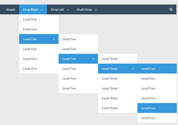
Thankfully there are plenty of modern navigation methods that can manage multiple levels of content. A common approach is having the main menu show the top 2-3 levels of content with another menu handling the levels below that.
In most cases the question of what menu style can be left to the web designer and web developer to work out.
There’s a good chance that your business will evolve over time. Our pretend department store may add a sports department, or decide to stop selling furniture.
Changes will impact your content hierarchy so it’s worthwhile to engage in some crystal ball gazing to see what the future holds and what you’d need to change to meet it.
A common mistake is people adding primary categories to their website to the point their navigation becomes unwieldy and hard to use. Going past eight primary categories will impact usability and your user experience.
If your business has changed so much your original content hierarchy has turned into a bloated monster the best thing you can do is start again with a clean slate and focus on what you’ve learnt from the previous years.
I have written about planning for the future in digital architecture here.
The content hierarchy should always direct your visitors to the content they are looking for. How does that fit with your own goals?
Physical stores can employ misdirection and attention hijacking where items are placed in high traffic areas with the sole purpose of selling customers items they may not necessarily want or need. A classic example of this is the sweets, magazines and confectionery around checkout areas to entice waiting customers (or their children).
However websites are not physical stores and at any time the visitor can leave the website. People online are generally time poor and any perceived hurdle adds to the risk that the visitor will give up and leave.
If you do have a goal in mind (the most common is to get people to contact you) that can be part of your content, rather than trying to design your content hierarchy to direct visitors to contact you. An example of this could be a visual call to action at the end of each piece of written content inviting visitors to get in touch. Again, categorise not prioritise.
There are a lot of misconceptions around how Search Engine Optimisation (SEO) interacts with content hierarchies. Some people think that content needs to be at a higher level to be valued by search engines.
For this reason we see people load their higher level pages with large amounts of text content, with the aim to catch search engines which are theoretically only looking at the top level pages.
Search engines are far cleverer than that and understand the home page > landing page > content page structure which many websites employ. Google Search Console also allows you to submit every single page in your website for indexing, but that’s another article.
Back to our pretend department store. Someone searching for toasters would know to go to the Kitchen department and look around for small appliances and then toasters. Online is similar; a search for “toasters” should lead to the landing page listing all toasters. If someone was searching for “dualit toasters” it should lead them to a page with details on Dualit toasters, even if it’s a level below.
A clear pathway to content is more important than a maze of interlinking text and screes of content.
Read about our approach to Search Engine Optimisation (SEO) here.
The content hierarchies is one of the most important parts of your website. The content hierarchy should be documented and signed-off before a visual design is started as it has a massive impact on the navigation and design of the site.
The key points are:
I hope this has been helpful. I plan to write more about website content soon.
Banner Photo by Kelly Sikkema